
What is an eCommerce Call to Action?
eCommerce call to action is a button to generate an action. In simple terms, it is a button on a webpage, banner, or content that allows users to complete specific actions, whether initiating a checkout process to complete a purchase, filling out a lead form, etc.
There are many calls to action we see every day!
Where are CTAs used?
CTAs, or Calls to Action, are used in various contexts across different mediums to prompt users to take a specific action. Some common places where CTAs are used include websites, email marketing, and social media.
If the target is to get more subscribers to a newsletter, using Subscribe Now on a blog page or content wall would act as a great CTA. On the other hand, if the goal is to make the user add a product to the cart, your CTA would be Add to Cart or Add to Bag.
In some cases where a newsletter has been sent, and the goal is for the users to click on it and visit the blog page on your website, the ideal CTA would be Learn More!
Use a CTA with an action associated. Whether clicking and reading more about a blog, adding a product to the card, clicking the submit button on your lead form, and much more.
How to optimize your eCommerce CTAs?
Use action words. Use words that move the focus from a desire to action, such as Order Now, Subscribe Today, Get the Offer, and more.
Create a sense of urgency. Have time reminders around your CTAs to convert users faster. It entirely depends on your business industry and category, but it is always good practice to create a fear of missing out.
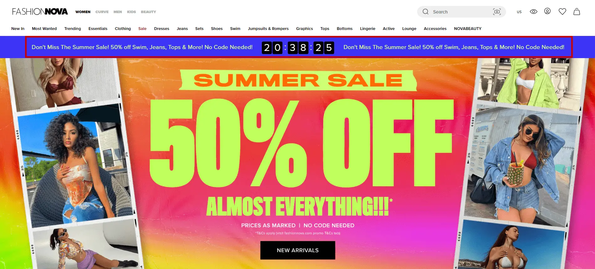
Also, it is essential to remember that time-based offers should go off when the time is up. It should not be just for generating sales! Below is an example of FashionNova, one of the top eCommerce websites in the world.
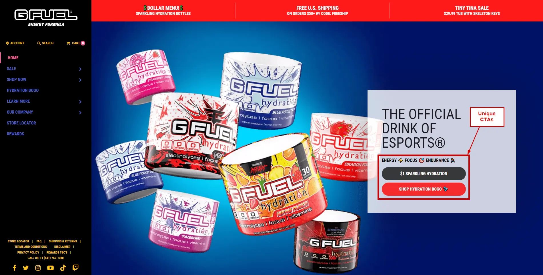
Keep your USP near the CTA. It’s a good practice to remind your users by highlighting your unique selling proposition near your CTA. This helps make decision-making more accessible for users who want to complete the purchase.
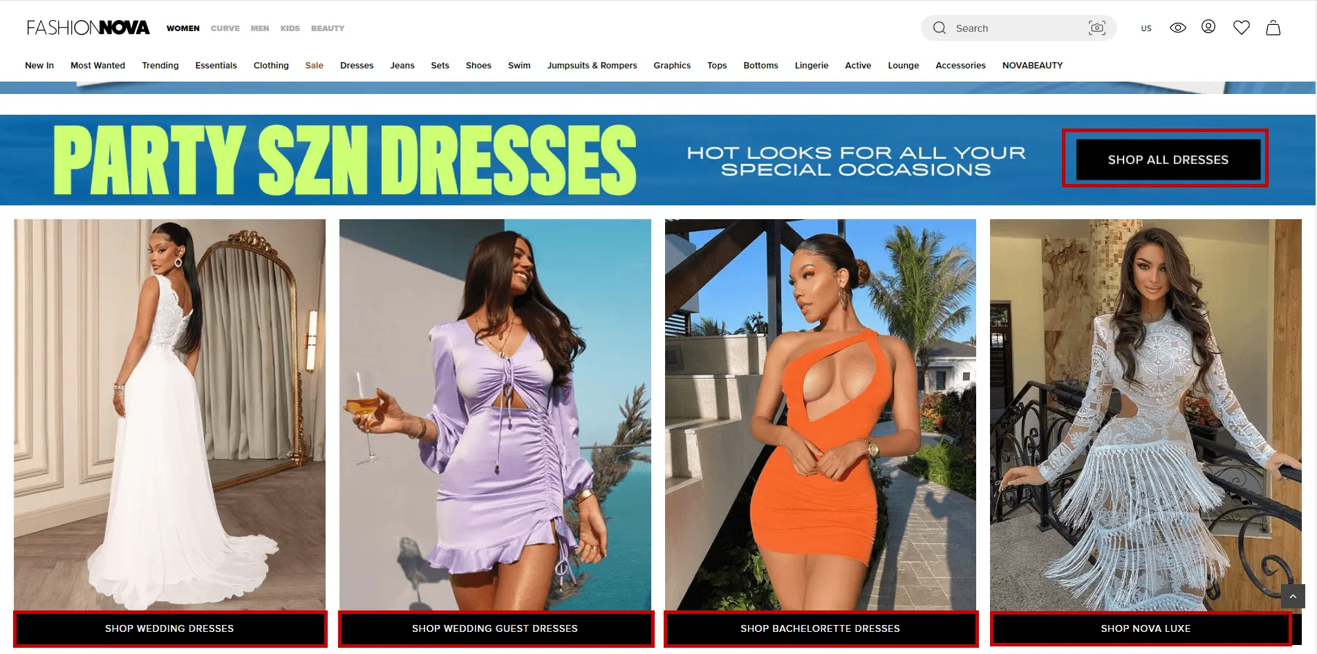
Make your CTA unique. Although mainstream CTAs do the job in many cases, creating unique ones that highlight your product or an ongoing offer is a good practice.
Add social proof: Highlighting reviews about your product is the best idea since it comes from users who have actually experienced it. The end-user can relate and proceed to complete the purchase accordingly.
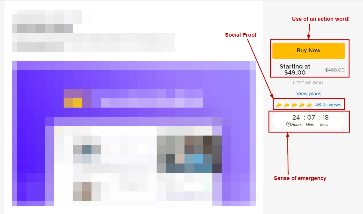
The example below is taken from AppSumo, where a product is being promoted, and it has the proper use of an action word, a sense of emergency, and social proof.
Does the Call to Action color matter?
Colors make all the difference when differentiating the content on your webpage from the actual CTA. CTAs should be eye-grabbing and pause-worthy to make the end user take a look at them and proceed to make a purchase.
Studies have shown that blue can improve creativity, but red increases memory and attention to detail. The psychology of color allows marketers to create logos and branding materials that will be more persuasive. Hence colors matter!
What are the best colors for CTA buttons?
As per a study by JoeHallock, Men, and Women favor different colors:
Blue seems to be the color that people prefer the most. On the other hand, Purple is the second top pick for women, while Green is the second for men.
You can change your colors depending on your audience targeting for ideal results. Although this should not be a benchmark for your CTA colors, it can be a great data point for testing colors on your eCommerce store.
How to make your CTA stand out on your product landing page?
Ensure the CTA color and content have some pause value, i.e., entice users to look at it at least once before they scroll further and know more about the product.
Top Call to Action phrases used on eCommerce websites!
Creating your unique CTAs is always good, but there are certain places where generic CTAs achieve all the required goals. Here are the top CTAs used by online businesses:
- Buy Now: The classic CTA for a user to make a purchase.
- Subscribe: Mainly used for newsletter subscriptions but can also be used for recurring product purchases.
- Join us: This, combined with a great offer, yields, creates sign-ups to pre-offers and early launch and is overall great for pre-product launch campaigns.
- Get started: When your product is not a one-time purchase but maybe an educational course, class, or something related to ed-tech, this CTA also works excellently for SaaS products.
- Add to Cart/Add to Bag: Before the user completes the checkout, this is an ideal CTA to have directly on the grid page where more than one product is highlighted.
Consistency, Colors, and CTAs
CTA colors on your landing pages to resonate with the brand! Just because specific colors work for particular audiences doesn’t mean they should be implemented immediately. Every brand has its own story and branding. CTA colors should be consistent and go hand in hand with the branding.
Although there are many ways to use different CTA colors, consistency with your branding colors helps maintain re-call value when the users revisit or do research similar to your product category.
Be clear about which parts of your page should get user attention. Don’t confuse your users using different call-to-action colors on the same page.
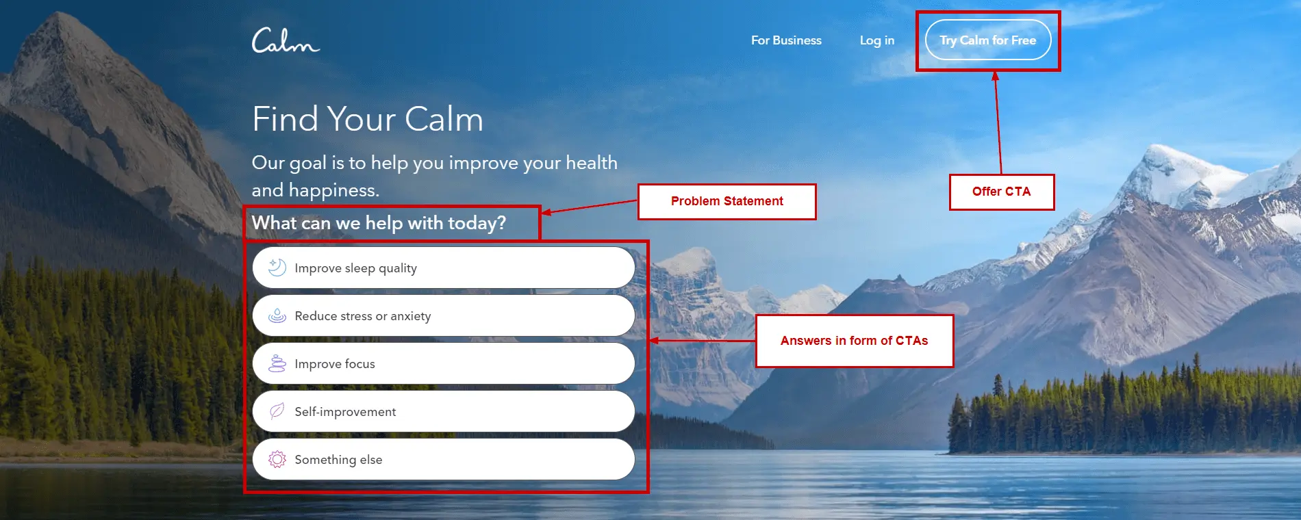
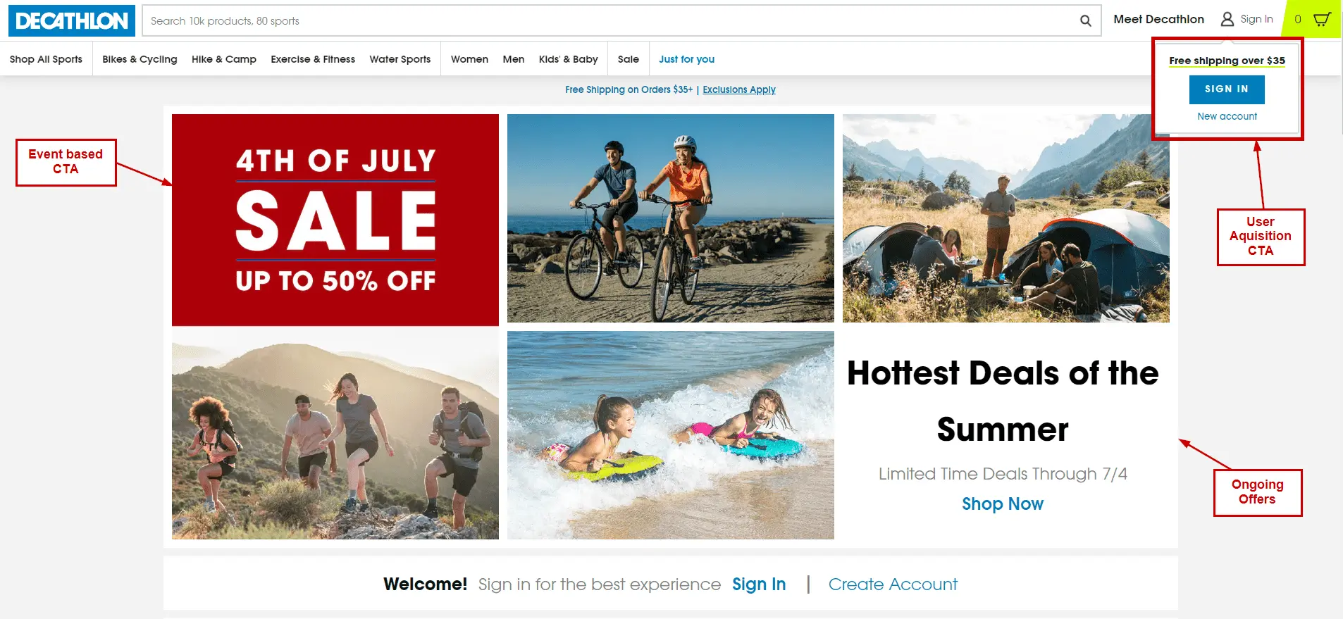
The best call-to-action examples!
Conclusion on eCommerce CTAs
CTA helps visitors take action by guiding them to the right content and place on your site. This article has given you a clear picture of what a Call to Action means and what a good CTA is. Now it is time to write an effective one for your landing page.
If you use the same example in all your call-to-action examples, there would be a higher chance of better conversion rates. So go ahead and implement today!