Tips for Accessibility in eCommerce

The world is becoming more inclusive, and eCommerce websites must follow suit. Accessibility ensures equal access and usability for people with disabilities.

In this blog, we will explore what accessibility is, its importance in eCommerce, and the guidelines to follow to ensure an accessible experience for all users. We will also discuss common issues in eCommerce websites and how to test for accessibility.

Lastly, we will share the concept of universal design and provide you with tools for Web Content Accessibility Guidelines (WCAG). Join us as we embark on this journey towards making eCommerce more inclusive for everyone.

What is Accessibility?

Designing digital material in a readily accessible manner for those with impairments is known as accessibility. Make sure material is viewable, utilized, comprehended, and handled in diverse ways. Closed captioning, keyboard navigation, and alternative text are features.

Why is Accessibility important for eCommerce?

Accessibility is crucial for eCommerce as it ensures equal access to online shopping platforms, regardless of abilities. Not only does it enhance user experience, but it can expand the potential customer base, increase revenue, and avoid legal issues related to discrimination. Prioritizing it can also boost a business’s reputation.

Who does inaccessible content affect?

Inaccessible content affects a wide range of individuals, including those with permanent disabilities like visual, hearing, mobility, or cognitive impairments, as well as older people and those with temporary disabilities. It is crucial to create accessible eCommerce sites that benefit not only disabled users but also mobile users and those with low network speed.

How does content become accessible?

Content accessibility requires text alternatives for media, closed captions or transcripts for videos, keyboard navigation, high contrast between foreground and background, and compatibility with assistive technologies. Providing these features can ensure equal access to information for people with disabilities.

testo scritto con i dadi

Accessibility Guidelines for eCommerce Websites

To guarantee that your eCommerce website is accessible, it is critical to adhere to the WCAG recommendations and industry best practices during the web design and development phases. For instance, to make the web accessible to those with impairments, several various web development and interaction elements must function together. 

These components consist of:

  • content – the information in a web page or web application, including:
    • natural information such as text, images, and sounds
    • code or markup that defines structure, presentation, etc.
  • web browsers, media players, and other “user agents”
  • assistive technology, in some cases – screen readers, alternative keyboards, switches, scanning software, etc.
  • users’ knowledge, experiences, and in some cases, adaptive strategies using the web.
  • developers – designers, coders, authors, etc., including developers with disabilities and users who contribute content.
  • authoring tools – software that creates websites.
  • evaluation tools – web accessibility evaluation tools, HTML validators, CSS validators, etc.

WCAG Compliance: Layers of Guidance

Conformance with the WCAG guidelines means taking care of all aspects of the web design and development process for equal access to users with disabilities. Conducting regular testing with assistive technologies like screen readers or voice recognition software ensures equal access for all users. The layers of WCAG 2.1 guidance consist of the 4 Principles, the 13 Guidelines, the Success Criteria for each guideline, and Sufficient and Advisory Techniques for each guideline and success criteria.

Common Accessibility Issues in eCommerce Websites

Implementing web accessibility guidelines is crucial to address common issues in eCommerce websites. Poor color contrast, lack of transcripts for audio content, and lack of alt text for images can make it difficult for users with visual impairments to understand the content.

Additionally, inaccessible forms and improperly tagged navigation can pose challenges for those who rely on keyboard navigation instead of a mouse. Ensuring accessibility standards conform with the Rehabilitation Act of 1973 adds universal design benefits beyond people with visual impairments or mobility impairments, including dyslexia and hearing loss.

How to Test for Accessibility in eCommerce

Ensuring that your web content adheres to accessibility guidelines is crucial in making sure that it’s inclusive and accessible for all users. For testing content, WCAG recommends using a “hybrid” approach, which combines two types of audits: 

  • Automated tests scan through content to find common barriers. Automation is inexpensive and effective, but human judgment is essential for identifying some types of barriers. There are companies that can run compliance audits or use accessibility checker tools such as Bureau of Internet Accessibility (BoIA), accessiBe, and userway.
  • Humans who have experience with screen readers and other assistive technologies (AT) perform manual tests. While manual testing is thorough, it can be time-consuming and expensive.

Accessibility: How to Design for All

Creating accessible websites involves considering accessibility from the start of the development process. You must continually evaluate and enhance your website’s accessibility. You can make your website easier and more accessible for all users using these guidelines while incorporating accessibility in your design process.

The Principles of Universal Design

Designing accessible websites is vital in today’s digital world. By following universal design principles, you can make sure your web content is usable by all individuals regardless of their abilities.

Use the 7 design principles such as

  • Equitable Use: The design is useful and marketable to people with diverse abilities,
  • Flexibility in Use: The design accommodates a wide range of individual preferences and abilities;
  • Simple and Intuitive Use: Use of the design is easy to understand, regardless of the user’s experience, knowledge, language skills, or current concentration level,
  • Perceptible Information: The design communicates necessary information effectively to the user, regardless of ambient conditions or the user’s sensory abilities,
  • Tolerance for Error: The design minimizes hazards and the adverse consequences of accidental or unintended actions,
  • Low Physical Effort: The design can be used efficiently and comfortably and with a minimum of fatigue, and  
  • Size and Space for Approach and Use: Appropriate size and space is provided for approach, reach, manipulation, and use regardless of user’s body size, posture, or mobility.

The Must-Have WCAG Checklist

Make sure that every individual can interact and engage with your digital assets successfully. The WCAG provides a comprehensive set of guidelines for designing accessible websites. Incorporating these best practices into your web design process can improve the user experience and increase your site’s usability and SEO. W3.org provides a customizable quick reference to Web Content Accessibility Guidelines (WCAG) 2 requirements (success criteria) and techniques.

The customizable quick reference is separated into the 4 principles: 1. Perceivable: 1.1 Text Alternatives, 1.2 Time-based Media, 1.3 Adaptable, 1.4 Distinguishable; 2. Operable: 2.1 Keyboard Accessible, 2.2 Enough Time, 2.3 Seizures and Physical Reactions, 2.4 Navigable, 2.5 Input Modalities; 3. Understandable: 3.1 Readable, 3.2 Predictable, 3.3 Input Assistance; and 4. Robust: 4.1 Compatible

Conclusion

In conclusion, accessibility is not just a legal requirement but also an ethical obligation. Making your eCommerce website accessible will provide a better user experience for everyone, regardless of their abilities. It can increase customer loyalty and improve your brand reputation.

To ensure you are following the best practices for accessibility in eCommerce, refer to our comprehensive guide on accessibility guidelines and principles of universal design. We have also included a must-have WCAG checklist to help you test your website’s accessibility. Let’s work together to create a more inclusive online world for all.

Call to Actions 101 – eCommerce Conversion Rate Optimization

What is an eCommerce Call to Action?

eCommerce call to action is a button to generate an action. In simple terms, it is a button on a webpage, banner, or content that allows users to complete specific actions, whether initiating a checkout process to complete a purchase, filling out a lead form, etc.

There are many calls to action we see every day! 

Where are CTAs used?

CTAs, or Calls to Action, are used in various contexts across different mediums to prompt users to take a specific action. Some common places where CTAs are used include websites, email marketing, and social media.

If the target is to get more subscribers to a newsletter, using Subscribe Now on a blog page or content wall would act as a great CTA. On the other hand, if the goal is to make the user add a product to the cart, your CTA would be Add to Cart or Add to Bag.

In some cases where a newsletter has been sent, and the goal is for the users to click on it and visit the blog page on your website, the ideal CTA would be Learn More!

Use a CTA with an action associated. Whether clicking and reading more about a blog, adding a product to the card, clicking the submit button on your lead form, and much more.

How to optimize your eCommerce CTAs?

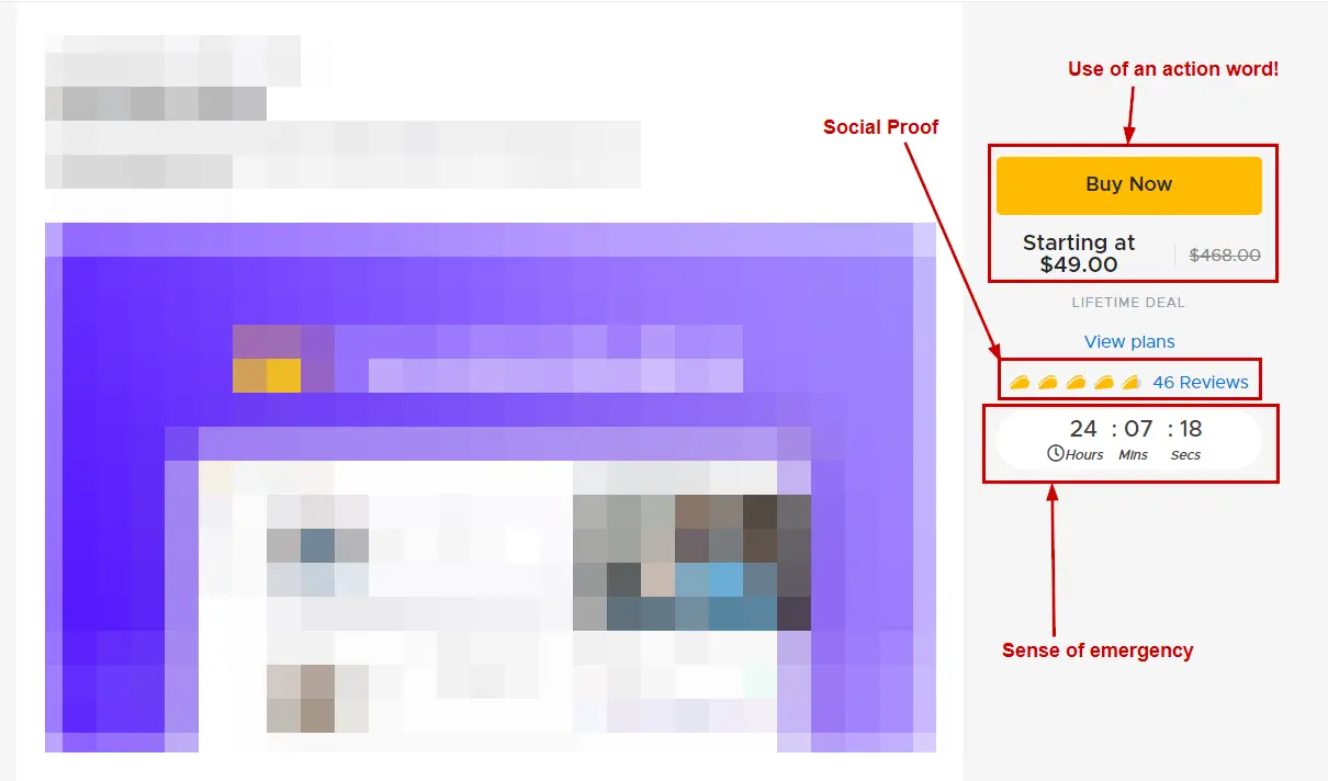
Use action words. Use words that move the focus from a desire to action, such as Order Now, Subscribe Today, Get the Offer, and more.

Create a sense of urgency. Have time reminders around your CTAs to convert users faster. It entirely depends on your business industry and category, but it is always good practice to create a fear of missing out.

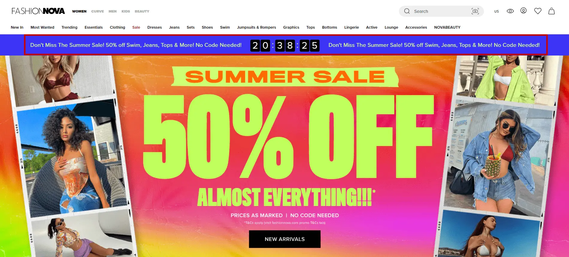
Also, it is essential to remember that time-based offers should go off when the time is up. It should not be just for generating sales! Below is an example of FashionNova, one of the top eCommerce websites in the world.

Keep your USP near the CTA. It’s a good practice to remind your users by highlighting your unique selling proposition near your CTA. This helps make decision-making more accessible for users who want to complete the purchase.

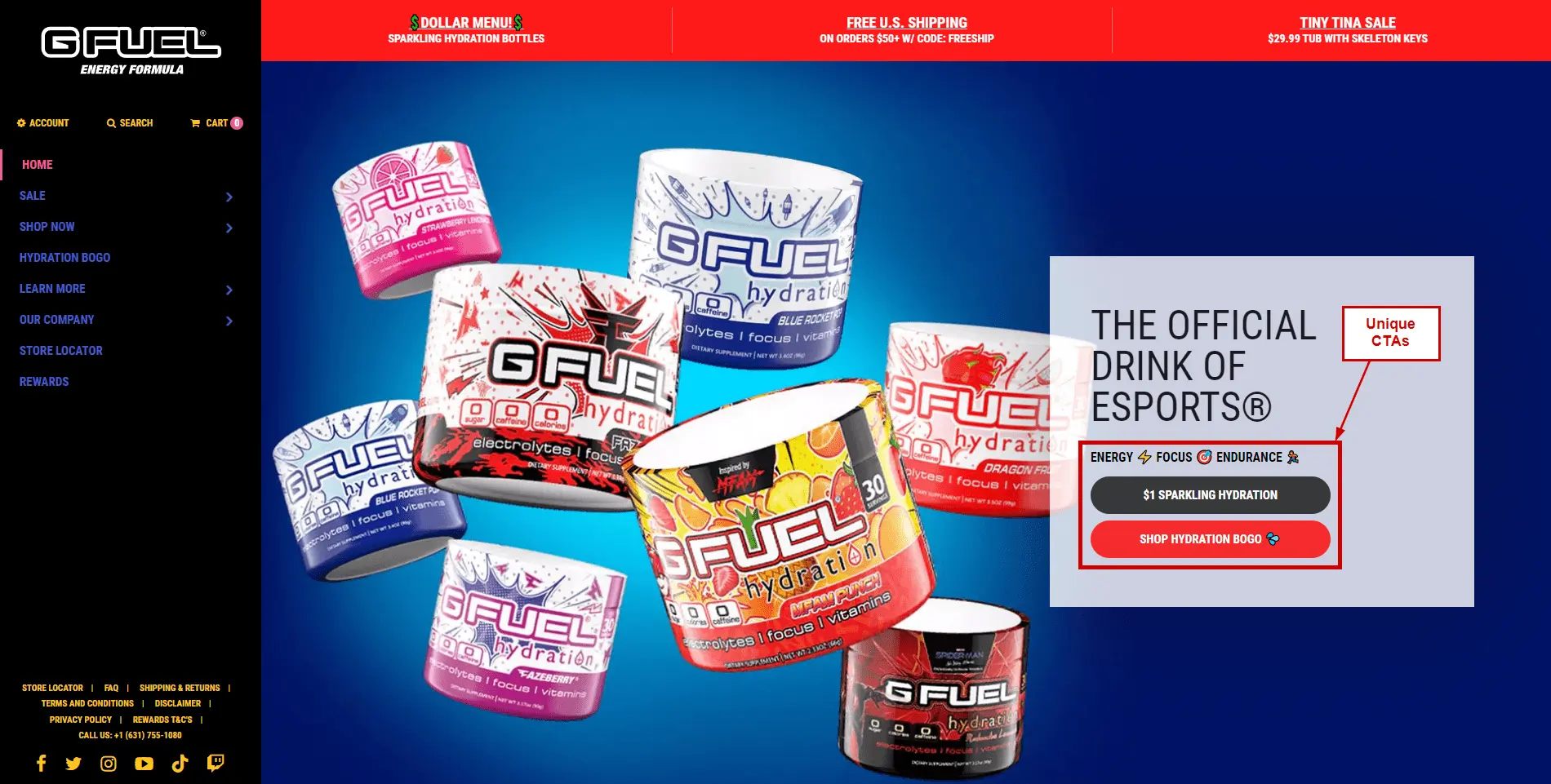
Make your CTA unique. Although mainstream CTAs do the job in many cases, creating unique ones that highlight your product or an ongoing offer is a good practice.

GFuel newsletter signup CTA – I LOVE SAVING MONEY! It is one of the most creative ways to highlight an offer.

Add social proof: Highlighting reviews about your product is the best idea since it comes from users who have actually experienced it. The end-user can relate and proceed to complete the purchase accordingly.

The example below is taken from AppSumo, where a product is being promoted, and it has the proper use of an action word, a sense of emergency, and social proof.

Does the Call to Action color matter?

Colors make all the difference when differentiating the content on your webpage from the actual CTA. CTAs should be eye-grabbing and pause-worthy to make the end user take a look at them and proceed to make a purchase.

Studies have shown that blue can improve creativity, but red increases memory and attention to detail. The psychology of color allows marketers to create logos and branding materials that will be more persuasive. Hence colors matter!

What are the best colors for CTA buttons?

As per a study by JoeHallock, Men, and Women favor different colors:


Blue seems to be the color that people prefer the most. On the other hand, Purple is the second top pick for women, while Green is the second for men.

You can change your colors depending on your audience targeting for ideal results. Although this should not be a benchmark for your CTA colors, it can be a great data point for testing colors on your eCommerce store.

How to make your CTA stand out on your product landing page?

Ensure the CTA color and content have some pause value, i.e., entice users to look at it at least once before they scroll further and know more about the product.

Top Call to Action phrases used on eCommerce websites!

Creating your unique CTAs is always good, but there are certain places where generic CTAs achieve all the required goals. Here are the top CTAs used by online businesses:

  1. Buy Now: The classic CTA for a user to make a purchase.
  2. Subscribe: Mainly used for newsletter subscriptions but can also be used for recurring product purchases.
  3. Join us: This, combined with a great offer, yields, creates sign-ups to pre-offers and early launch and is overall great for pre-product launch campaigns.
  4. Get started: When your product is not a one-time purchase but maybe an educational course, class, or something related to ed-tech, this CTA also works excellently for SaaS products.
  5. Add to Cart/Add to Bag: Before the user completes the checkout, this is an ideal CTA to have directly on the grid page where more than one product is highlighted.

Consistency, Colors, and CTAs

CTA colors on your landing pages to resonate with the brand! Just because specific colors work for particular audiences doesn’t mean they should be implemented immediately. Every brand has its own story and branding. CTA colors should be consistent and go hand in hand with the branding.

Although there are many ways to use different CTA colors, consistency with your branding colors helps maintain re-call value when the users revisit or do research similar to your product category.

Be clear about which parts of your page should get user attention. Don’t confuse your users using different call-to-action colors on the same page.

The best call-to-action examples!

Fashion Nova – Offer CTA on the landing page followed by category-based CTAs
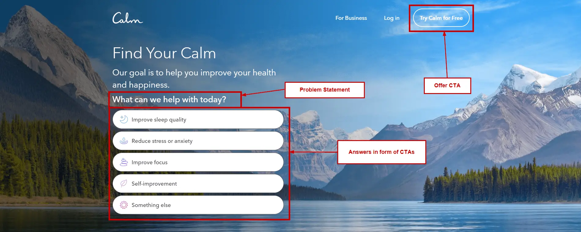
Calm App – The subtle use of CTAs and highlighting an offer.
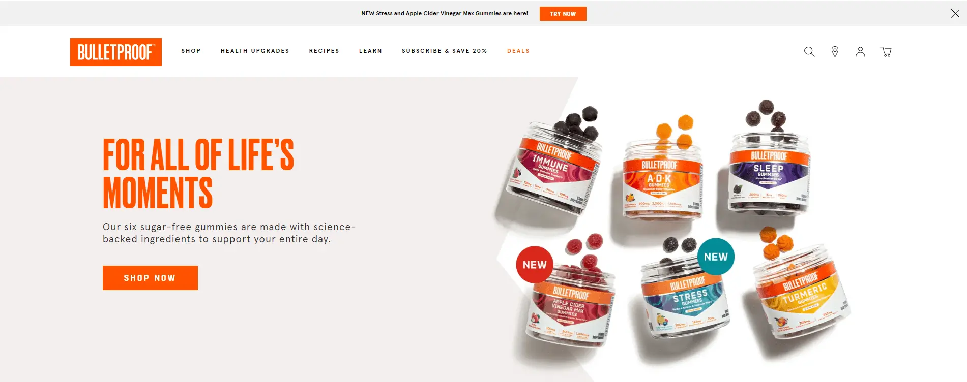
 Bulletproof – Even after using one of the top disliked eCommerce CTA colors, they have managed to be one of the most successful eCommerce stores in the world. The ideal example of your brand colors must be consistent even if your audience might not like it.
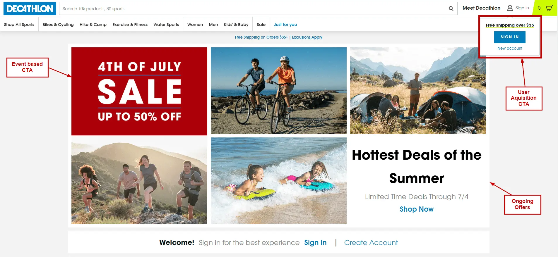
 Decathlon – Although their landing page might have a lot of elements, the CTAs differentiate the content and help users navigate through the site.

Conclusion on eCommerce CTAs

CTA helps visitors take action by guiding them to the right content and place on your site. This article has given you a clear picture of what a Call to Action means and what a good CTA is. Now it is time to write an effective one for your landing page.

If you use the same example in all your call-to-action examples, there would be a higher chance of better conversion rates. So go ahead and implement today!

eCommerce SEO 101 Conversion Rate Optimization

Why is eCommerce SEO vital for an online store?

Before we start, here are a few statistics that make eCommerce SEO a vital part of conversion optimization. Let’s have a look…

  • 7.5% of all traffic to eCommerce sites comes from search. (SEMrush)
  • Of the billions of searches on a given day, 15% of daily searches are new to Google. (Search Engine Land).)
  • According to Think With Google, at least 51% of people using the internet have found out about a new product or company online.
  • Google Images, Google Maps, and Google search account for at least 92.96% of the global organic traffic (Sparktoro)

On page – eCommerce SEO 101

Most people are aware of on-page eCommerce SEO changes required to optimize your website, but there are a few key factors that shouldn’t be ignored.

  • Don’t avoid On-page for generic pages: Homepage, About page, Contact page, Work page, Clients, etc. Don’t neglect these vanity pages when it comes to On-page SEO for eCommerce websites. Coming up with interesting titles and a good call to action can improve your bounce rates significantly.
  • Focus on content and being to the point: Adding content to your website to squeeze a few more keywords on-page is not a great practice in 2022. Make your content pop by using good action phrases. Highlighting USPs is a good practice; providing value to the user is another method (Free downloads, Answers for FAQs, etc.)
  • Slow page loads due to large images: Although website speed optimization is a whole different process making it standard practice to check for image file size helps improve on-page by a great margin. No user would want to wait before getting to read, download or fill out a form.
  • Image SEO: Image search is one of the top sources of traffic generation via Google, and having the right SEO strategy in place for product images can place them in front of the right audience (Audience searching for it – High intent audience.

There are a lot of on-page eCommerce SEO guides. Here are the top points we feel are the most important when it comes to ranking and keeping the user engaged at the same time.

The most important On-page factors for eCommerce SEO.

  • Title: The section that can grab the most attention and make users click on it. Titles are by far the ROI generating when done right. Highlight a value proposition in your title. Keep it focused and simple.
  • Product Description: Using Power and Action words in your description to talk about your product benefits and ongoing offers works wonders. Adding timelines for offers that are not going to last is great for creating a constant reminder for the user.
  • Examples: Before power/action words – 5% Off on all our products. Valid till “xx:xx:date” After power/action words – Superb Offers: Get 5% Off Storewide. Valid for 36 hours!
  • Right Product Images: This is the most ignored in the eCommerce space. We believe that just having generic 2D images is not enough anymore. VR/AR images for your product are the way to go now, it entirely depends on your industry, but if it looks like a possibility for the products, do it!
  • The Keyword Magic: Adding keywords with content that goes hand in hand is the best way to optimize your product pages. Long-tail keywords in eCommerce have comparatively less competition and more intent. Ranking for such keywords will help boost your overall store performance.

Keyword Research – eCommerce SEO 101

  • eCommerce keyword research: One of the most critical steps when executing your eCommerce SEO strategy is having the right keywords in your arsenal. Keyword research requires good tools to analyze the monthly volumes for each keyword and understand the difficulty of ranking each keyword.
  • Pick your suited bunch of keywords: Selecting the right keywords for your products is the main goal to achieve this. Leave the top and bottom keywords alone i.e., keywords with highest difficulty and highest volumes and lowest difficulty with lowest volumes should be kept aside at first.
  • Best tools for eCommerce keyword research: Ahrefs, SEMRush, Ubbersuggest and Google Keyword Planner are by far the best tools when it comes to doing your eCommerce keyword research.

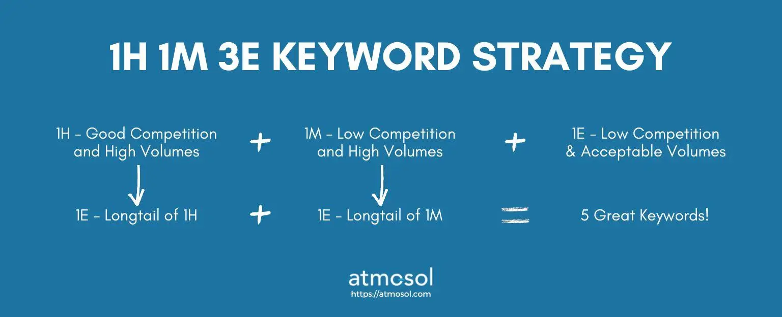
The 1H-1M-3E eCommerce SEO Keyword Strategy: This strategy includes picking 5 keywords starting with 1 Hard, 1 Medium, and 3 Easy. To break it down, an eCommerce store can go with the hard keyword being something that is not extremely competitive (60+ difficulty) but has good amounts of competitors and difficulty. One of your easy keywords will be a long tail form of this hard keyword.

Next is to pick the medium keyword that is not hard to rank and has good monthly volumes; your second easy keyword will be a long tail form of the medium keyword. The last one is an easy keyword, and this one should have low but acceptable volume and low competition.

Link Building – eCommerce SEO 101

  • Email Outreach to the right people: Although this method has very low ROI, the links you get to build out of this strategy are high quality and rank-worthy.
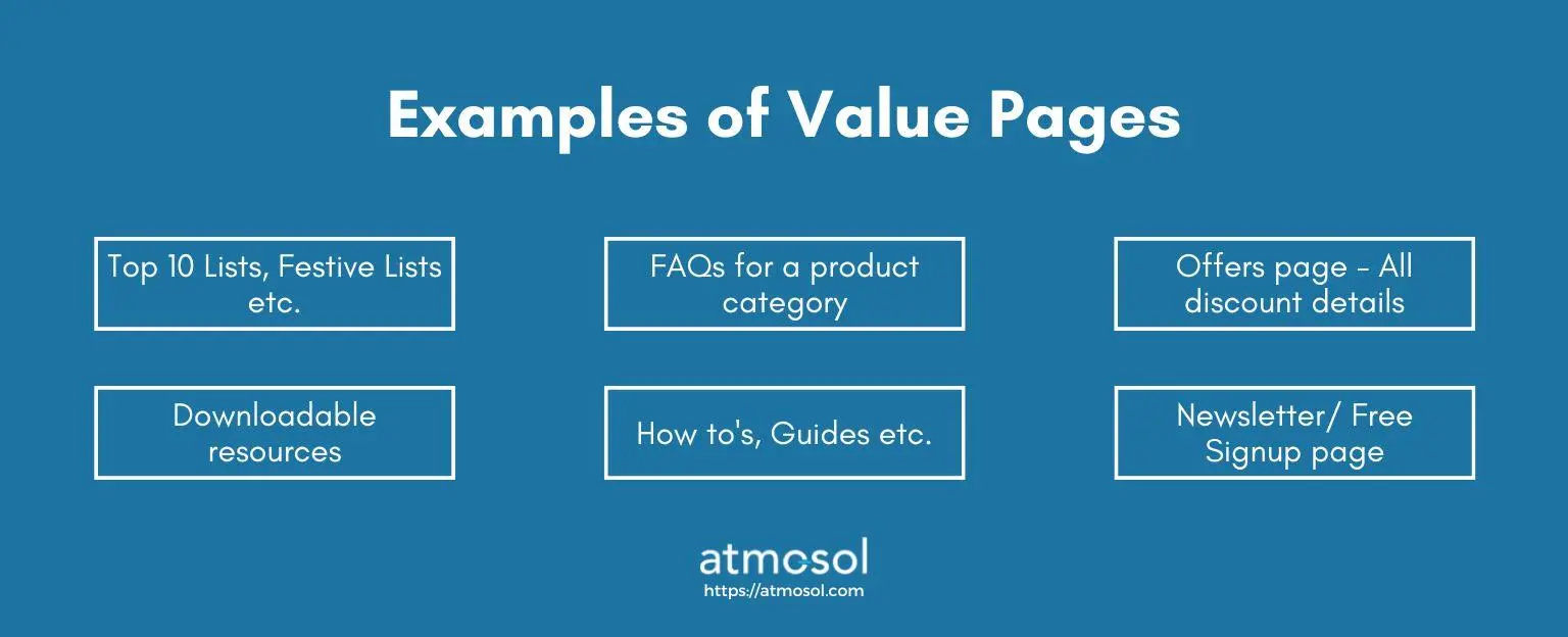
  • Resource pages and value creation: Most eCommerce websites do not implement this strategy; let’s say it has been a secret for a while now. Creating lists/ top 10s/  Resource sheets are amazing ways to improve your brand reach and promote your products.

eCommerce SEO is not always about your product pages. It involves creating value for visitors. The more visitors your business has, the better the probability of an increase in users that ultimately leads to more conversions, thereby more revenue.

  • Broken Linkbuilding: Many blogs on the internet provide links to resources and references but most of these are not maintained over time, and a few go out of existence.

Consider you have found a blog that links to a webpage that doesn’t exist anymore, but one of your blogs has a similar context and can be a great reference point for the blog. Draft an email explaining the same and send it to the blog owner. Depending on how they feel about your idea, they will implement it.

  • Collabs and guest posting: In 2022, a better version of collabs and guest posting exists. We call it influencer marketing. Depending on how your brand wants to position itself, your brand can opt-in for influencer marketing.

Website Architecture – eCommerce SEO 101

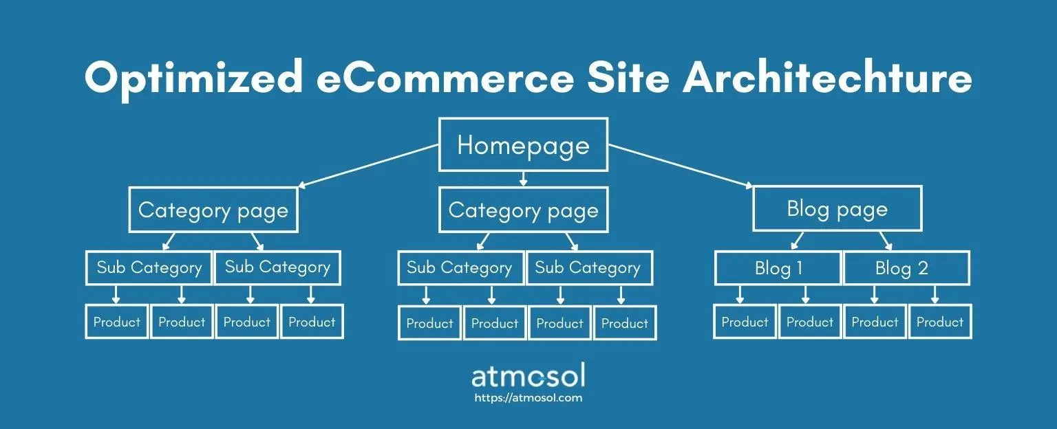
A website’s structure is crucial for eCommerce SEO; it not only defines how the search engine looks at it but also creates the user’s navigation process. A good website architecture will hold users for longer periods and be more sure to provide them with something before their attention fades.

  • The page layouts: This step isn’t directly related to SEO, but it affects one of the most important ranking factors, i.e. your website’s bounce rate. Optimizing your website User Interface and Experience can yield multifold results, so avoid ignoring it. Running A/B tests on your pages is a great strategy to find what resonates better with customers.
  • Main landing pages: Make sure all your landing pages have proper and unique meta tags (title, description and URL). Duplicate metatags can cause indexing problems and even copy data penalties if not monitored properly.
  • Category pages: The most ignored pages can create tons of value when optimized well. Category pages should never be auto-generated pages for eCommerce websites. A great eCommerce SEO strategy will always include creating and optimizing category pages to allow users to navigate better throughout the website.
  • Post/Blog pages: Not all eCommerce websites have blogs and miss out on improving reach and grabbing more market share for their product keywords. As mentioned previously, it is always a great idea to display your products and make lists depending on ongoing events (Example: Winter Special, Summer Sales, Top 10 things etc.)
  • Product Pages: Highlight product USP and pricing well. SEO-optimized product titles and descriptions that explain the product in detail are other important factors too.
  • Product Images: Many eCommerce businesses ignore product imaging, the only way consumers can understand the product. Implementing AR/VR, if possible, is a great way to offer the end user a real-life feel of how the product would look like.

Conclusion

In 2022 and onwards, eCommerce SEO is not only about making search engines happy but also focusing on your user experience. An ideal eCommerce website is one where users can easily navigate, understand the product, and make a purchase.

UI/UX in ecommerce web design and development

UI/UX web design and development is the process of designing a website so that it is easy to use and visually appealing. A website’s user interface or user experience (UI/UX) of a website refers to the graphics, layout, design, functionality, and performance. It is important for a website to be user-friendly because customers will spend more time on a website if it is easy to use. However, making a website look good and responsive is not the only concern – consider usability also. For example, if a search engine can easily index your website and find the information users seek, you’re doing well! A group of scientists from Northumbria University found that 46% of consumers in the study made their decisions regarding the credibility of websites based on visual appeal and aesthetics.

What is the difference between UI and UX?

User Interface (UI) and User Experience (UX) are two important aspects of web design. UI is the look and feel of a website, while UX deals with how users interact with it. UI is more concerned with the visual elements of a website – things like graphics, layout, colors, etc. UX, on the other hand, focuses on how well users understand and use the site’s features. It considers such factors as ease of navigation, finding what you’re looking for quickly, and ensuring information is presented understandably. Both are important, but they work differently to help users achieve their goals. UI helps people find what they’re looking for easily by providing clear visuals; meanwhile, UX ensures that information is easy to understand so that users can get the most out of it. These two elements create a user-friendly website that will help your business thrive.

Why is UI/UX important in eCommerce web design and development?

UI/UX (User Interface/User Experience) is important for two primary reasons in web design and development: first, it improves the user experience, and second, it increases conversion rates. By making your website more user-friendly and easier to navigate, you’ll likely attract more customers looking for a positive online shopping experience. Properly designing and implementing user flows will ensure that users can find what they’re looking for quickly and easily – boosting conversion rates even further! So, make sure to design and implement user interfaces and user experiences that are both elegant and effective, and you’ll be on your way to a successful eCommerce website design and development project.

Better user experience leads to increased conversion rates

Creating a good user experience is essential for ensuring high conversion rates. This is because it helps customers find what they are looking for much faster, leading to increased sales. In addition to making navigation easy and effective, creating appealing visuals can also help increase conversions by drawing users in. However, good user experience isn’t just about looks – it’s also important to keep things simple so that even novices can navigate your website easily. If all these elements are put together correctly, then you’re guaranteed success in increasing your eCommerce website’s conversion rate!

Enhances brand reputation

A well-designed and user-friendly website is one of the best ways to enhance your brand reputation. It helps customers feel like they are part of your company while making it easy to find what they’re looking for. Furthermore, a great website ensures that all relevant information is easily accessible and looks great on any device. It’s important to keep the overall look and feel consistent so that users have a positive experience from start to finish when visiting your site.

Increases loyalty and customer base

Customer satisfaction is key when it comes to building a successful website. By effectively communicating with your customers, you can increase loyalty and boost your customer base. Plus, if the experience on your site is great – from design to navigation – people are more likely to return often and recommend you to their friends. Ensuring all user inputs are easy to understand also helps keep visitors returning for more. It’s important to focus on design and usability to ensure your visitors have a great time while they’re here!

Trends for UI/UX in eCommerce web design and development in 2023

The focus on usability and user experience (UI/UX) in ecommerce web design and development will continue in 2023. This means that designers must focus on how users interact with the website. This includes designing for different devices, such as smartphones and tablets, as well as desktop browsers. Additionally, designers must consider how users search for information on the web. By doing so, they can create a website that is easy to use and efficient for customers.

Web-accessibility

Web accessibility is becoming a bigger trend in web design and development. In 2023, it will be more important than ever to make your website accessible to everyone. This means that products and pages should be easy to understand and use, no matter what your disability is. For customers with disabilities, making your website fully accessible will mean they don’t have to struggle with navigation or finding the information they are looking for. In turn, this will help you attract a wider range of customers – both disabled and non-disabled alike. So, if you’re not already taking web accessibility seriously, start now!

Inclusivity

Inclusivity is important in web design for several reasons. First, it’s a fundamental principle of human rights and social justice. All people deserve to be treated fairly and equally, regardless of their race, ethnicity, sexual orientation, or disability. Secondarily, inclusive web design leads to more satisfied customers, making the shopping experience more pleasant for everyone involved. Finally – and perhaps most importantly – inclusion boosts brand loyalty and SEO rankings because it sends a positive message about your company’s values and mission statement to potential consumers.

Advanced Personalization

Interactive tendencies are the trend that many ecommerce websites will rely on in 2023. Customization is the key to success in today’s digital world. People want information that truly reflects their interests. Make the design more customer-centric to succeed. This means designing each piece of content, images, and interactions with the individual user in mind. This way, customers will feel like they’re getting a personal experience rather than simply consuming information on a mass scale. Businesses must understand this concept to remain competitive in an ever-changing market landscape.

Geolocation & Browser-Based Content

When creating and publishing web content, it is important to consider how your users will interact with it. That is fundamental in UI/UX. For example, if you target browser-based content such as articles or blog posts, ensure the design is compatible with all browsers. In addition to designing for compatibility across browsers and devices, ensure that your website’s overall design aesthetics are visually appealing and engaging. This way, more people will be inclined to explore what you offer – leading to better conversion rates!

Minimalism

Minimalism is a design trend that’s currently in vogue. It’s a simple, sleek approach that uses minimal elements to create an effective and professional look. As e-commerce websites become more sophisticated, users seek user-friendly and easy-to-navigate designs. In addition, they want a design that can be customized according to their specific needs. By keeping the focus on making all elements easily accessible and stylish at the same time, minimalism achieves these goals quite effortlessly. This trend also incorporates the effective use of white space, which helps achieve an airy and spacious feel overall.

White Space

Regarding web design, white space has been and will be important. This refers to using empty areas of a page layout or graphic design for aesthetic purposes and not for functionality. White space can be used in various ways to create an airy, lightweight design – from using margins and padding as well as typography to creating spaces between elements on a page. By adopting a minimalistic approach, you can utilize white space better and achieve the desired effect. Keep your designs user-friendly by ensuring all elements are intuitively placed so customers don’t have too much trouble completing their purchases or navigating through your website. In doing so, you’ll ensure that users enjoy navigating your site and return repeatedly!

Color

Gradient and ombre colors are popular options for web design because they create a sense of rhythm and harmony. They also add personality to websites, making them more engaging and compelling to users.

Gradient colors work best when the background color transitions gradually from one color to another. This creates a smooth look that is easier on the eyes. Ombre colors work best when the main foreground or background color changes gradually but not abruptly. This allows the eye to flow smoothly between different colors without being jarred or confused.

Together, these effects can help make your website visually appealing and easy on the eyes. Use them wisely to achieve optimal results!

Chat Bots

Chatbots are quickly becoming one of the most popular methods for ecommerce businesses to interact with their customers. They allow businesses to create a more personal experience by automating customer service tasks. Chatbot interactions can be automated and scheduled to increase efficiency and decrease response time.

So, why is chatbot usage increasing among ecommerce websites? There are several reasons. First, they reduce the workload for human operators who can focus on higher-value activities such as product development or marketing campaigns instead. Second, chatbots provide a more engaging user interface that can help convert leads into customers faster than traditional forms of online interaction. Third, they offer exponentially growing data that business owners can use to improve their overall strategy and operations.

Smart Video

Video is a great way to connect with customers and build relationships. By using video content wisely, businesses can create a positive experience for the viewer and the business itself. Here are some tips on how to make your videos smart and engaging: 1. Make sure that your videos look good on all devices – desktop computers, laptops, tablets, smartphones, etc. 2. Use graphics and animation to draw the user in – it will help keep them interested in what you have to say. 3. Use clear navigation so viewers don’t get lost or frustrated while watching your video. Always provide links back to relevant pages on your website so viewers can learn more about what you’re selling or promoting easily! 4. Use video as an opportunity to teach your customers about products or services in a fun, informative way- this could lead to increased traffic into your store!

Dark Mode

In 2023, dark mode will be a UI/UX web design and development trend. The dark mode is becoming more and more popular on social media platforms. Meta, Twitter, Instagram, and Reddit all have dark modes. Here are some key reasons why:

– Dark mode is easier on the eyes. You can reduce eye strain and fatigue by making the background lighter than the text.

– Dark mode reduces screen glare in bright environments. Screen glare causes headaches and other symptoms when looking at screens for extended periods.

– Dark modes are less distracting than light modes. When it’s difficult to focus on a screen because it’s too bright or busy, using a darker color palette makes it easier to focus on what you’re reading or watching.

Augmented Reality

Augmented reality (AR) is a technology that overlays digital information on top of the physical world. It creates navigable 3D environments, interactive objects, and live video streams.

Shopify found that brands using AR saw retail conversion rates increase by around 250%, as customers are more likely to make purchase decisions when they can see the product in a realistic environment.

AR and VR can help retailers market their products beyond their normal customer base. Online communities devoted to particular genres, such as cooking or fashion, often use AR or VR extensively for product demonstrations.

As augmented reality becomes more mainstream, businesses worldwide will reap the benefits. Integrating it into your marketing strategy allows you to reach new potential buyers who would otherwise never consider your brand.

Conclusion

UI/UX is a critical element of web design and development, as it helps to create a user interface that is easy to use and visually appealing. By understanding and incorporating UI/UX into your design and development processes, you can create a functional and user-friendly website.

To learn more about the AI trend, read our blog here.

How do online reviews affect online businesses?

Before we get started about reviews here are a few fantastic facts:

Online reviews are the best way for potential clients or customers to know what you are about. If people are happy with the goods or services that you offer, then they will be sure to leave you a positive review. However, if they have a bad experience, then it is likely that they will leave you a bad review. This blog will look at how the online reviews that you receive can affect your online business.

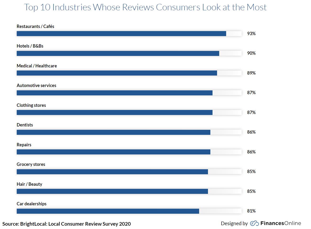
  • 95% of all consumers check online reviews of businesses (2018 consumer review, BrightLocal)
  • 63% of customers read online reviews before visiting a local business (2018 internet survey, ReviewTrackers)
  • 66% of all consumers buy a product from a local business after they read the online reviews (2018 internet survey, ReviewTrackers)
  • 88.8% of consumers say that their trust in a brand decreases if it has negative reviews. (eMarketer, 2019)
online-review-statistics

Do online reviews affect a business? Why reviews are important for your eCommerce business.

Yes, online reviews can have a significant impact on a business. Reviews provide an impression to your potential customer of how your current customers feel about your product. Their likes and dislikes. When customers first get introduced to a product, most of them would like to understand what other customers have to say about your product before making a purchase.

Positive online reviews and testimonials confirm that the product your business is selling is actually good and meets the needs of an end-user.

Reviews position a product separate from those that are not genuine and or have less visibility. In simple terms, it is a filter for a customer to find whether what they are looking at is actually a good purchase or not.

Reviews are not only applicable to products. They also apply to services; the channel where the customer shares a review might change, but feedback is still of great value for every business looking to grow.

This factor has become so important that some companies have even started incentive programs for current customers to leave reviews as a way to get a conversion out of potential customers.

How to get online reviews for your eCommerce business.

Ask your customer to review your product (good or bad) at the end of a purchase.

About a week after a sale, follow up with an email thanking the customer for the purchase and asking if they would leave a review. Provide a link to make the review.

Look at your sales reports and reach out to the customers who have spent the most with you and request a testimonial.

Create an incentive program where customers get something for leaving a review.

Follow up with customers who leave great reviews thanking them.

What questions to ask in a review/testimonial request?

  1. Would you recommend this product/service? If so, why?
  2. What are the benefits of this product/service?
  3. How does this product help you fix your problem?
  4. Would you buy this product/service as a gift? If so, why?
  5. How do you feel about the quality of the product/service?

Building a community with reviews

Having a community vouch for your product(s) or services is the 24×7 sales strategy that keeps benefiting your business. The more people believe in your product, the more it will sell, thereby improving your total business revenue.

You can build customer loyalty by allowing people to use their own clicked photos of the products. You can then highlight their pictures on your website and social media. This will show your customers how the products look and be a great way to get people to buy your products.

You can also create a gallery of the best photos that are created by customers or by yourself as a customer. This is a great way to have people feel appreciated when they buy your product and share it with their friends.

Use reviews to increase conversions

Here are a few more interesting stats about Social Proof:

  • 79.9% of customers admit that their trust in a brand increases when the brand responds to negative reviews or comments. (eMarketer, 2019)
  • The trust of 93.7% of digital shoppers in a brand increases because of positive reviews. (eMarketer, 2019)
  • 93.4% of online shoppers rely on customer reviews when researching online retailers they are not familiar with. (Sabanoglu, 2020)
  • If a product has a higher star rating and a $2 price difference than the other product, most people will buy the expensive option with better ratings. (Kats, 2019)

Since the customer cannot touch or feel the product in real life, the conviction to buy the product decreases. When faced with such challenges, customers resort to image and text reviews of a product to understand the experiences of others who actually made a purchase.

Highlighting reviews on emails, websites, social media, and ads can assist in moving a user from consideration to the conversion step of a funnel.

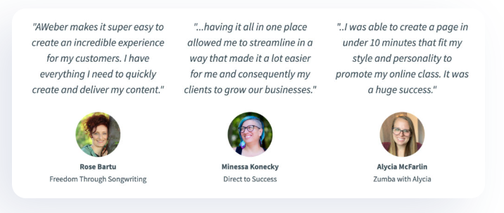
Add reviews and social media feeds to your home page and/or emails. If the reviewer is a company, make sure to include the logo along with the face, name and title.

customer testimonial example

If you are an eCommerce business looking for a Digital Agency. Our team of experts would love to assist you with your requirements. Feel free to contact us.

Optimizing User Journey – eCommerce Conversion Optimization

This article is part of a series of articles from atmosol on eCommerce conversion optimization. This article focuses on optimizing the user journey. Today’s eCommerce users are pampered by the excellent user experience provided by leading retailers and will shop elsewhere if your site can’t compete at the same level. Let’s look at some user journey optimizations that can be considered to improve conversion.

Improve Product Discovery

Users find a product they are looking for in different ways depending on how and where they landed up on your site. Making sure they can find what they are looking for at each of these landing pages is crucial to reduce bounce rates and improve conversion. Let’s look at a few different ways users find products

Home page Merchandising

Images and products on the home page are what a user who lands on the home page sees first and hence is the best location to promote products that customers are most likely to buy if they are simply browsing and haven’t made up their mind about what to buy. Personalization of the home page can significantly improve click rates on these products since the customers see products that are to their taste. The home page can also be the right place to surface products that you want customers to see, like new product launches or more profitable products.

Merchandizing is hard to get right even in physical stores and is best optimized through A/B testing of different combinations to measure click-through and conversion.

SEO spelled out using scrabble tiles

Search and its role in eCommerce Conversion Optimization

If a user lands on the home page of a store looking for something specific, there’s a high chance they will use the search functionality to search for the product. If search is able to return results that customers are looking for and want to buy, it eases one step of the user’s journey on the website. While this seems easy enough and is supported by most platforms, there are some nuances that a store owner should be aware of

Catalog content

Any search tool is only as good as the content in your catalog since the search engine us essentially using the content to find and display products. Add different synonyms to your products catalog to display them when users search for the same product in using different words.

Spelling Errors

Many modern search engines are able to handle spelling errors, but if you are using one that doesn’t handle spelling errors, it helps to add common misspellings to your catalog. Whatever the method, stores should stive hard not to show the dreaded “No products found” message which almost always drives customers off the site.

Autocomplete

Autocomplete enables users to quickly search for products in your catalog and avoids spelling errors by prompting them the correct spelling. It also enables stores to surface content that might further refine a user’s search. For example, a user searching for “outdoor table” might see an option for “outdoor table with umbrella” and if that’s what the user really wanted, it guides the user to the right search results and eliminates undesired results.

Natural language processing

Another important aspect of a search engine to consider is its ability to understand natural language especially in searches like “Phone case” vs. “Phone with case” where understanding the conjunctions and language constructs becomes important to understand what the customer is looking for

Personalization

Personalization of search results is a relatively new concept that personalizes results based on a user’s previous interactions and popular searches. When implemented correctly, this gives the users a feeling of easy discovery.

Filters

While filters are not necessarily part of search, a good set of filters make up for deficiencies in search capability by enabling the user to further refine the search for the exact product manually. Displaying the right set of filters can sometimes be hard especially for stores selling multiple categories of products that require different sets of filters. Planning early for filters and having the right attributes in products for filters can make this task easier.

Direct Links

Users can also land up directly on a category page or a product page when clicking through from marketing links on the internet. When users land on a page this way, it’s important to make sure that your marketing links all lead to pages with relevant results and not to your home page or a generic page. For example, if a user is searching for “Green T-Shirt” and you land the user on a page with all T-shirts, there’s a high likelihood that the user will leave the page not wanting to sift through everything.

computer screen using photoshop

Improve Product Page

Product detail pages (or PDP in short) is another page that can make or break conversions. Once the customer has located a product, this is the page where the decision to add it to the cart is made. Following are few optimization guidelines

High Quality Images

Product images are the first things that customers look at when opening a product detail page. Having great images keeps the customer on the page and interact further with the page until a decision to add the product to cart is made. Having crisp, large product images and videos with the ability to zoom, pan, rotate, etc. is one of the best investments a store can make to increase conversion.

Technologies like Virtual Reality and Augmented Reality (AR/VR) can provide even better visualizations for higher value products to give the customers more confidence in what they are buying.

How Sales Copy helps in eCommerce Coversion Optimization

Well-written sales copy can evoke the right emotion and nudge the customer towards making the decision to add to cart. Best of brands create a brand voice ahead of time and create content using that voice to appeal to their ideal customer persona. Considering the tone and language of your content and how it represents your brand will enable you to appeal better to your target customers.

Complete Information

While the sale copy evokes the right emotions, product pages that lack enough information about the product often don’t convert well, especially for certain product categories. For example, furniture stores have to consistently display dimensions, weight, etc. in order for customers to make the right decision.

Call to Action

Having “Add to Cart” displayed prominently at eye level is known to increase conversion rate. Although a single button is ideal in terms of reducing clutter, some stores like Amazon have benefited from having another “Buy Now” option that speeds the checkout process. A/B testing can determine what works best for your store.

Psychological Triggers

Psychological research has identified several triggers that can nudge customers closer to wanting a product. Following are a few that have been used successfully by many eCommerce retailers​

Trust

Including things like social proof, customer reviews, secure and transaction badges can achieve increased trust. This has the effect of reducing friction by eliminating the question of trustworthiness from the customers’ mind and is especially important for brands that don’t have significant name recognition.

Urgency

Urgency is known to impact purchase decisions and can be triggered through limited time offers.

Scarcity

Scarcity refers to text like “Only 2 available” that signifies that a product might sell out if the customer doesn’t buy now

Improve Checkout

Making checkout as frictionless as possible while addressing any final concerns in the customers’ mind reduces abandoned carts where the customers decides not to buy after adding items to cart. Following are a few aspects to consider

person using phone to make payment on POS system

Payments

Payment issues cause a significant amount of cart abandonment because a customer is unable to make a payment.

Payment Methods

Enabling as many payment methods as possible will ensure that customers are able to pay using their method of choice. Following are some common payment methods that can be enabled on a site. When picking a payment gateway, stores should make sure they are able to support all or most of these methods

  1. Credit Cards/Debit Cards: The most preferred method to complete an online purchase.
  2. Prepaid Cards: An alternative for credit/debit cards.
  3. Bank Transfer: Although this method is not used much, it’s sometimes useful when the product value is higher.
  4. E-wallets: When platforms provide you with their own payment solutions (PayPal, Cash App, Google Pay, Apple Pay, Venmo etc.)
  5. Digital currencies: Cryptocurrencies are slowly being accepted on many platforms since they allow international payments with ease and reduced documentation.

Fraud Prevention

Fraud prevention sometimes clashes with ease of payment and makes payment harder and sometimes rejects payments that are not fraudulent. Stores must determine the right balance between fraud detection and ease of payment. Fraud detection services like that are used by a large amount of customers are able to use aggregated data from all the stores they serve to better detect fraud with minimal false positives. Stores should consider if such a service is right for them

Trust

Although we discussed trust on the product page, it is more important to display trust badges to assure the customer that payments made through the platform are safe at the checkout stage.

Return Policies

Customer friendly return policies that are prominently displayed further assures the customer that they can buy without the fear of being stuck with a product they don’t want. Free and easy returns cost your store money, but in almost all but the lowest value products, it’s usually a net positive. As in all the aspects of conversion optimization, stores can experiment with a few policies to see if there is an opportunity to reduce cost without affecting conversion.

Checkout our previous blog about heatmaps and how they impact conversion optimization.

Heatmaps 101 – eCommerce Conversion Rate Optimization

Website heatmaps are a great tool to optimize conversion on your eCommerce store. These tools record and enable store owners to visualize user activity on the store. It creates a heatmap of where the user hovered, clicked, and stayed the most to help improve the User Interface and Experience (UI/UX).

Heatmaps give deep insights into people’s behaviour on the site, helping eCommerce store owners discover why users aren’t adopting/purchasing their product, using call-to-action (CTA) buttons, or converting.

Benefits of using heatmaps on your eCommerce website:

Heatmaps are valuable tools for eCommerce websites as they offer actionable insights into user behavior, help optimize website layout and design, and ultimately contribute to improving user experience and increasing conversions.

What an eCommerce website owner can learn from heatmaps?

Heatmaps help understand how to improve design, user experience, and much more. Here are a few things that heatmaps can help you optimize on your eCommerce store:

  1. eCommerce Heatmaps help identify user pain points and friction during checkout and simplify steps to checkout or on opt-in forms.
  2. Detect user conversion issues due to the addition of fees like shipping/handling.
  3. Understand what images are clicked and what matters for users when they view a specific product page.
  4. Assist you to understand whether a specific CTA is getting clicked or if it’s not grabbing attention as expected.
  5. Find out what elements give the impression that they are clickable elements leading to rage clicks by users. Markedly, this process helps improve the user experience.
  6. Understand how website elements are portrayed on different devices and optimize them accordingly to improve website conversion rate.
  7. Find and fix links that have broken links and wrong re-directs. This strategy is very beneficial when you have lots of products and tons of interlinking for SEO purposes.
  8. Understanding important content and web page sections that otherwise are ignored.
  9. And finally, experiencing and understanding issues across devices (Improving User Experience)

How to use heatmaps for optimal performance?

Lorem ipsum dolor sit amet, consectetur adipiscing elit. Ut elit tellus, luctus nec ullamcorper mattis, pulvinar dapibus leo.

1. The click tracking heatmap:

  • Click tracking gives a visual representation of the average number of times a user clicks on each link/button on your site. If a button/link is not clicked as expected, it might be too far from the middle of the page which will reduce likelihood of user click.
  • If users are not clicking, stores can also experiment with different colors to better attract their attention.

2. The move tracking heatmap:

  • Mouse hover tracking heatmap helps in understanding mouse movements and identifying what catches users’ attention when they land on a website. This is also known as eye tracking as most users tend to keep the mouse where they are looking.
  • Comparatively, tracking eyeballs and mouse can help sites identify if important elements on the page like the “Add to Cart” or “Buy Now” button is in the right location on the page.

3. The scroll tracking heatmap

  • Use scroll tracking heatmap to understand the percentage of users that have viewed a portion of a webpage. The most important data to analyze with scroll tracking is what catches attention most of the time, where the users are waiting longer and make sure to improve that section or keep it as is depending on the performance.

Heatmap Tracking Examples

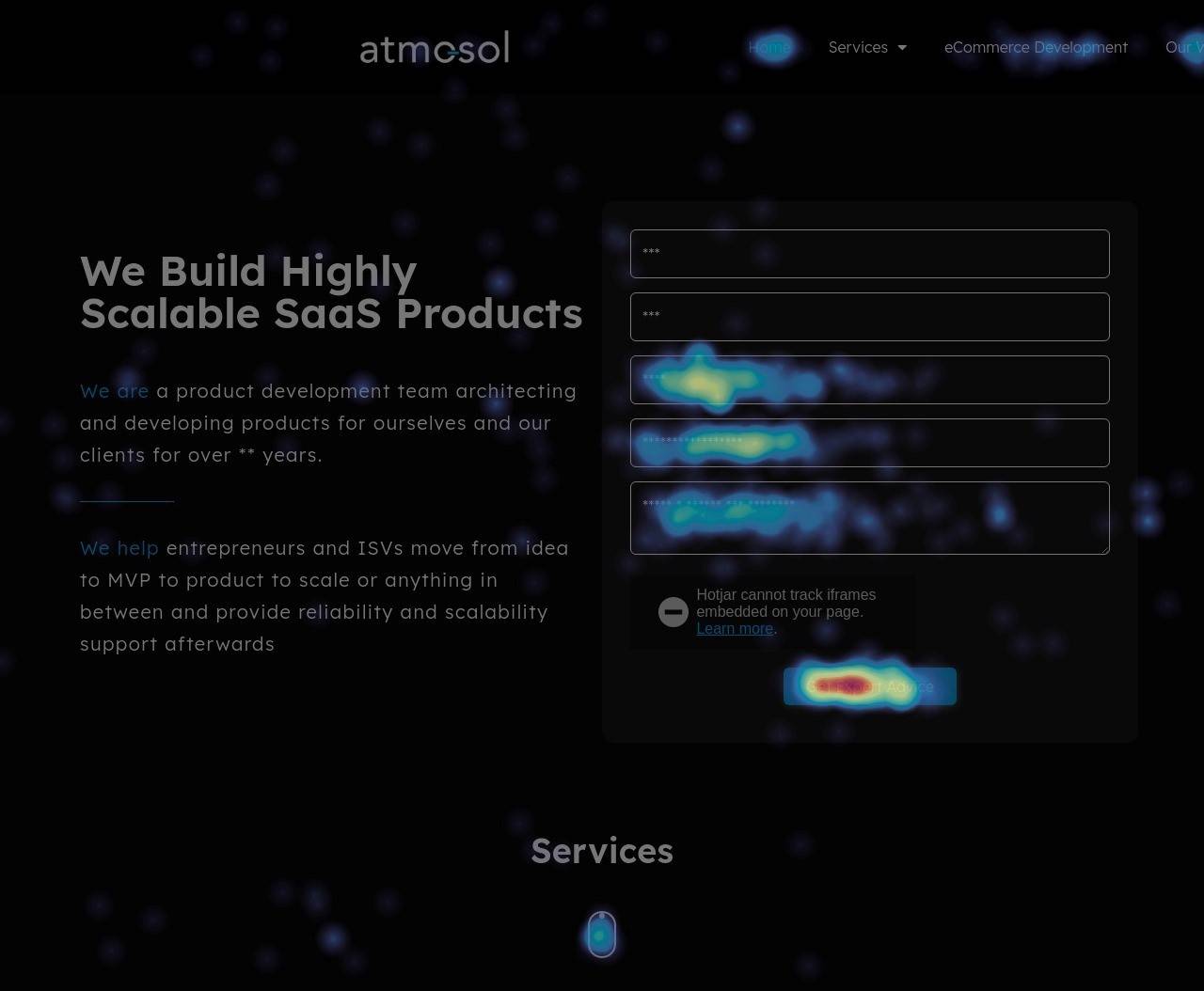
The heatmap tracking below shows where users clicked the most on one of our landing pages.

click heatmap example
This is a heatmap example from one of our landing pages (Above the fold) - Click Heatmap.

As seen in the screenshot above our form gets lots of clicks and the top 2 boxes are getting very less reasons helping us understand that our form fills are being done using autofill.

Next is the button at the bottom that scrolls to the next section of the website, this helps us understand that our UI is being conveyed well and end-users are finding it easy to use.

Furthermore, we have a few clicks on the left side content section. This helps us understand that users might be considering that text as clickable so we could potentially make changes to that section.

The below images shown is just Above the Fold (ATF) data from one of our landing pages. It conveys so much data that we can use and improve our website performance. 

scroll heatmap example
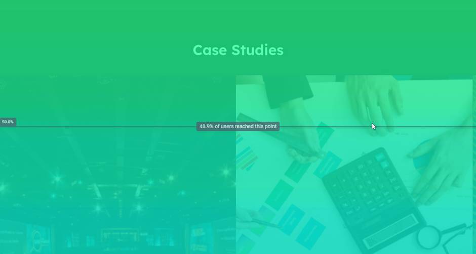
Heatmap Example: Screenshot of one of our landing pages (Above the fold) - Scroll Heatmap.

As per the scroll heatmap above it shows that 48.9% of our users on that specific landing page view 50% of our content. Are there any takeaways here? Of course!

For instance, we can make our page a little more compact so users could view more content on our landing page. Additionally, we should also analyze what content our users have missed and take a vote on whether we want to highlight that content by moving it higher on the page or not.

click heatmap example on contact form
The move Heatmap - Sample screenshot from one of our landing pages.

As shown in the image above the mouse movements are highlighted and areas where the mouse stopped (cursor stopped or a click happened) are highlighted areas.

On the bottom left of the image is the color scale of the heatmap from Blue to Red, Red being an extremely heated section of the page for this type of heatmap.

Best Heatmap analysis tools for your eCommerce website

1. Microsoft Clarity – Microsoft Clarity provides website usage statistics, session recordings, and heatmaps. Microsoft Clarity helps you understand how users interact with your website. Clarity Is Free Forever. Free Session Replay. Free Heatmaps.

2. Hotjar – Hotjar is an intuitive, visual way to discover, consolidate, and communicate user needs. Hotjar has three pricing plans: Basic, Plus, and Business. In addition, they also offer other plans for enterprises with requirements for scale in terms of session tracking.

3. Plerdy – Multifunctional tool that offers heatmaps, session recording, click tracking, and more to analyze user behaviour and improve site design.

4. Inspectlet – Let’s record videos of visitors as they use, click, move and scroll through the website. See every mouse movement, scroll, click, and keypress on your site. You don’t need to use traditional analytics anymore. You can know how your users are using your site in an instant.

5. CrazyEgg – Use CrazyEgg to see what’s hot and what’s not and know what your web visitors are doing with tools such as heatmaps, recordings, A/B testing & more.

Summary of eCommerce Heatmaps

A graphical representation of your user data will help in understanding how every element is being taken by the end-user and assist the web development team in making required changes to improve that experience.

For an eCommerce website, heatmaps are a vital component. The level of data they bring to the table in terms of understanding what products are being liked and clicked, what users find hard to click on and much more is important.

We believe that every website should implement this and analyze it at regular intervals to understand and improve its user experience.

If you are a business looking for a Website Speed Optimization partner, feel free to contact us

Website Speed Optimization 101 – eCom Conversion Optimization

Before we start with Website Speed Optimization 101...

This article is part of a series of articles from atmosol on eCommerce conversion optimization focusing on website speed. Google gives it a high priority when deciding the website’s place in search results. Website speed has a significant impact on conversion, but don’t take just our word for it. Here are some statistics from Industry leaders.

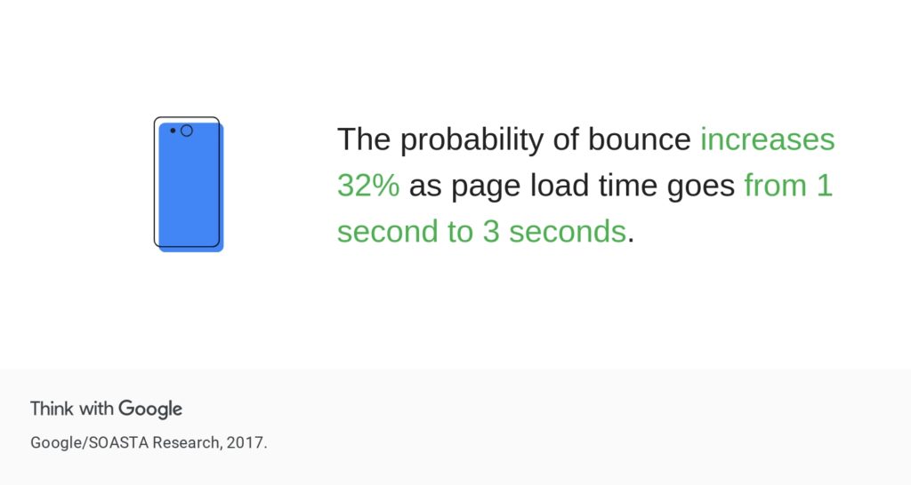
  1. 53% of mobile site visitors will leave a page if it takes longer than three seconds to load (Akamai) – That’s like losing more than half of your visitors for a 3-second delay!
  2. Around 70% of people say that the speed of a page affects their willingness to buy from an online retailer (UNBOUNCE)
  3. Improving your load time by 0.1s can boost conversion rates by 8%. (Google/Deloitte)
  4. If an eCommerce site loads slower than expected, over 45% of people admit they are less likely to make a purchase (UNBOUNCE)
  5. A two-second delay in page speed can increase bounce rates by 103% (AKAMAI)
  6. Half of the consumers browse for products/services on their smartphones, while only one in five complete purchases using those phones (Akamai Online Retail Performance Report).
  7. The average web page takes 87.84% longer to load on mobile vs. desktop (Backlinko).

How to Measure Website Speed

If you are not sure whether your website’s speed is up to the mark, you can use tools like Google Pagespeed Insights  Speeds to test the speed of your website. These tools will color code and give you information regarding the acceptability of the speed of your websites at least for SEO. And it’s safe to assume that those are the speeds your customers want too.

Optimize Server Speed

Optimize the configuration of the platform and optimize the infrastructure that the platform is installed on to achieve eCommerce server optimization. In this context, the selected platform and implementation dictates which kind of optimization is needed and possible

Open-Source Platforms

Open-Source platforms like Magento or WooCommerce provide the server and the client needed to create a store. Businesses host the required infrastructure on-premise or on a third-party server and decides the size of the infrastructure based on their needs. Here there’s a need for the business to optimize both the infrastructure and the settings, giving businesses ultimate control, but also increased responsibility.

SaaS Platforms for Website Speed Optimization

SaaS platforms like BigCommerce and Shopify also provide the server and client, but the server is hosted by the platform companies and all the stores on those platforms are hosted on shared infrastructure. This means that businesses need to and can only optimize configurations and not the underlying infrastructure. This might seem like less control, but barring very few scenarios, these platforms provide a very high level of performance.

Following are some server-side configurations that are common for e-commerce platforms for server-side and website speed optimization.

Indexing

Most platforms have settings around how often data is indexed so queries on the data can run faster. If searches seem slow, this might be the first place to check.

Server-Side Caching for eCommerce website speed

Server-Side caching caches commonly requested data on the server so it doesn’t have to be retrieved from the data store. Third party software like Redis, Varnish are sometimes part of platforms and can be enabled.

Log-Rotation

Another reason for server slowdown or even crash is misconfiguration of logs, whether they be logs in your database or just logging by the platform itself.

page load time increase chance of page load time

Optimize network latency from server to client

A significant number of optimizations on eCommerce stores usually performed are of this kind. The idea here is to reduce the number of requests that the browser has to send to the server and to reduce the size of responses that come back from the server. Following are some of the common network optimizations possible.

Compress & Optimize Images

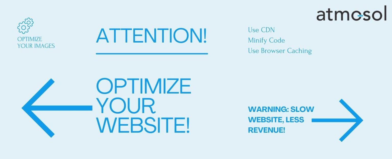
Images are usually the largest part of the size of data that needs to be transferred to an eCommerce website. These can be compressed with a free online tool, such as Compressor.io. This is the best way to get more space on your site without compromising the quality of the image. Modern image formats like WebP can also be used to reduce size depending on platform support. Finally, make sure that the images are the right size for the intended usage.

Minify & Compress Code

Minification reduces the size of your code by removing unnecessary characters to reduce size. Compress code to reduce size even more. Most platforms support minification and compression out of the box and this is just a configuration.

eCommerce website speeds improve after implementing this website optimization step.

Deferred Loading

Loading files only when needed gives the user of the store the ability to interact with the store before everything is loaded. For example, code that is note needed until a user performs some action and images that are not immediately visible on the first page can be deferred to improve speed of first load.

Use Bundling

Bundling is the process of reducing the number of requests to the server from the client by sending multiple files in one go. Carefully optimizing bundling based on usage patterns on each page can improve speed. Once again, this is usually a setting on the platform.

Use Browser Caching to improve website speed

Stores can be configured such that the browser caches some of the files it downloads from your server. Setting a cache expiry based on how often you expect files to change can significantly improve speeds when a user visits your store more than once.

Use a Content Delivery Network (CDN)

Content delivery networks (CDNs) are used to deliver static content and web applications to customers. They store copies of your static content, such as images, fonts, JavaScript files, and CSS stylesheets, on multiple servers that are geographically distributed across the Internet. This reduces latency and increases the speed at which content is delivered. Several content delivery networks like Akamai, Verizon, and Fastly exist for this purpose.

Don’t forget to integrate using a CDN to your website speed optimization strategy.

optimize your website

Optimize client speed for rendering content

Data that is retrieved from the client needs to be interpreted and displayed on the browser. In the case of most platforms that provide a default client (or frontend), this is achieved by carefully selecting any add-on components like themes and extensions based on their performance. However, it’s possible that the platform-provided client code itself is slowing down the site in some scenarios. Platforms are built to support a broad set of functionalities and generally load functionality regardless of whether a particular store needs it. If this is required for your store, it might be time to explore headless.


If you are a business looking for a Website Speed Optimization partner, feel free to contact us